Tag Archives: office

Office 2010 confirmed for June next year…

Microsoft today confirmed to Ars Technica that Office 2010 is expected to be in general availability by June 2010, after a beta tester apparently reported similar information.

The good news to that is that we should hopefully have 6 months of beta testing! Awesome.

However, don’t get too excited. OK, Windows 7 did actually launch on time, but Vista and Office 2007 were severely delayed. Microsoft aren’t brilliant at meeting deadlines, lets face it!

Oh well. GEEK! will keep you posted if any other news crops up, but for now lets hope that Office 2010 is worth it. Personally, I am yet to see anything that makes Office 2010 worth upgrading from 2007 (or 2003 for that matter). It still uses the annoying DOCX format unless you specifically tell it not to use it – but that removes some features from Word.

If you haven’t got your hands on the Office 2010 beta, you can grab a copy here.

Office 2010 Beta – The review

I’ve been testing Office 2010 for quite a while now, as I was part of the Technical Preview which Microsoft launched a little while ago. Now they’ve closed up the Technical Preview and replaced it with the Beta, which is now publically available for all to download and try out. I’m not entirely sure if Microsoft are limiting the amount of downloads, but if you want to be safe I suggest you download it now and give it a try.

Anyway, it goes without saying that Office 2010 is a huge improvement on Microsoft’s last attempt on an office suite – Office 2007. I’ve hated 2007 from the start. I thought the interface was clunky, confusing and time consuming. It was difficult to use, and anyone who was used to the simple menus of Office 2003 would have to learn how to use the programs all over again, from scratch. It’s like a car company saying we’ve made a new car, but to use it you’ll have to learn to drive all over again.

However, Microsoft have finally made a practical use of the futuristic design. The new menu bar is still there, but it is now usable. Here’s a little screenie…

Office 2010 Beta

Yes, it does take a little getting used to, but the basics are so much easier to access. All your common features are reachable at your fingertips.

I have to say that I like it. However, I don’t think this will be the case for everyone. I think it’s quite comparable to a car. If the car has a dashboard that looks like a small section of mission control, it becomes irritating and pointless. It’s the same for Office in that respect. If you’re typing out a document and you can’t find a feature hidden away in some submenu it is irritating and pointless – it’s exactly the same. I think Microsoft needs to think about this before launching a final version next year. I think they should maybe think about a “classic” mode, where people can use an interface which is comparable to older versions of Office.

Overall, I think it’s good and will prove successful. On the other hand, Microsoft needs to think about older users who are used to Office 2003 or even older versions. I think it’s really important that Microsoft holds on to it’s long term customers – letting them creep away now could be critical.

Office 2010 beta on Technet/MSDN

Good news! Office 2010 beta is now on Technet and MSDN which means that hopefully, it will be publicly available within the next week or so. It would be nice!

I’ve been on the technical preview for a few months now, and it is brilliant but it does have its problems here and there.

So hopefully the new version will be a bit more comprehensive and practical.

GEEK! will let you know as soon as the beta is publicly available.

New in Office 2010 – The new “dashboard” (as I like to call it)

Well, as promised, I’m going to be doing some in depth previews at new features in Office 2010. Today, we’re going to have a look at the new replacement of the “ribbon button”‘.

In Office 2007, there was a circular “ribbon” button that users would click to get the general functions of Office – such as getting a new document, saving, printing etc.

Now, the “ribbon” button has been replaced by a simple rectangular button, as shown below.

officebutton

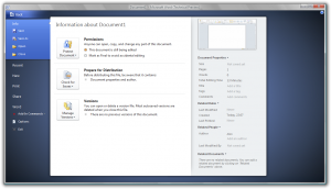
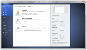
Click it, and you’ll get a brand new “dashboard”. Here is the one for Microsoft Word.
officeworddashboard

There are differences to the “dashboard” for every piece of software in Office 2010 – they all have their own colour and they each have different options specific to each piece of software.

In the “dashboard”, you’ll find all the features you’d expect in Office – new document, open, save, print etc. You’ll also find recent documents and ways to share the document with others.

It’s all fantastic, and I really love the new idea. However, it does have its problems:

  • When you are in the “dashboard” and you click the red X (exit) button, it closes the whole of Office, rather than just the “dashboard”. Ok, it is something you’ll get used to and remember not to do, but it can be really annoying. You just have to get used to using the ‘Back’ button at the top left of the dashboard. I’m sure Microsoft will do something about this before the final release, though.
  • The print button is a little unobvious – you click the ‘Print’ section, choose your settings, and then its quite hard to find the ‘Print’ button. The button you have to click is actually at the top left, but it was a little hard for me to find at first (yes I know – you’re thinking “well how dumb can you get?!”, but honestly – you don’t see it at first).

Other than that, I really like this new “dashboard”. It works really well, and it’s really easy to access. Good one Microsoft!

First looks at the Microsoft Office 2010 Technical Preview with screenshots

Well, I was very pleased to receive an email from Microsoft early this morning letting me know that I’d been accepted for the invitation only Office 2010 Technical Preview. So I’ve got my copy, and I’m going to do a little review here so people can get an idea of what they are in for.

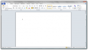
Well, to be honest, I’m pretty impressed with it. The GUI is pretty similar to Office 2007’s, but there are some pretty cool new features that have really brushed up the usability of Office. The image below shows a typical new Word document in Office 2010:

office2010

If you view the image full size (click it), you’ll see the ribbon from Office 2007 has gone – hoorah! It’s been replaced with a new button with the Office logo, which is a different colour for each piece of Office software. Click it, and you get a handy little menu of Options. Here’s what it looks like in Word…

2010menu

It’s quite cool. Anyway, that’s enough of a taster for now. Over the next couple of weeks, I’m going to do a series of blog posts outlining the highlights of Office 2010, so stay tuned to GEEK!.